 Infant Mortality Rates: NYC
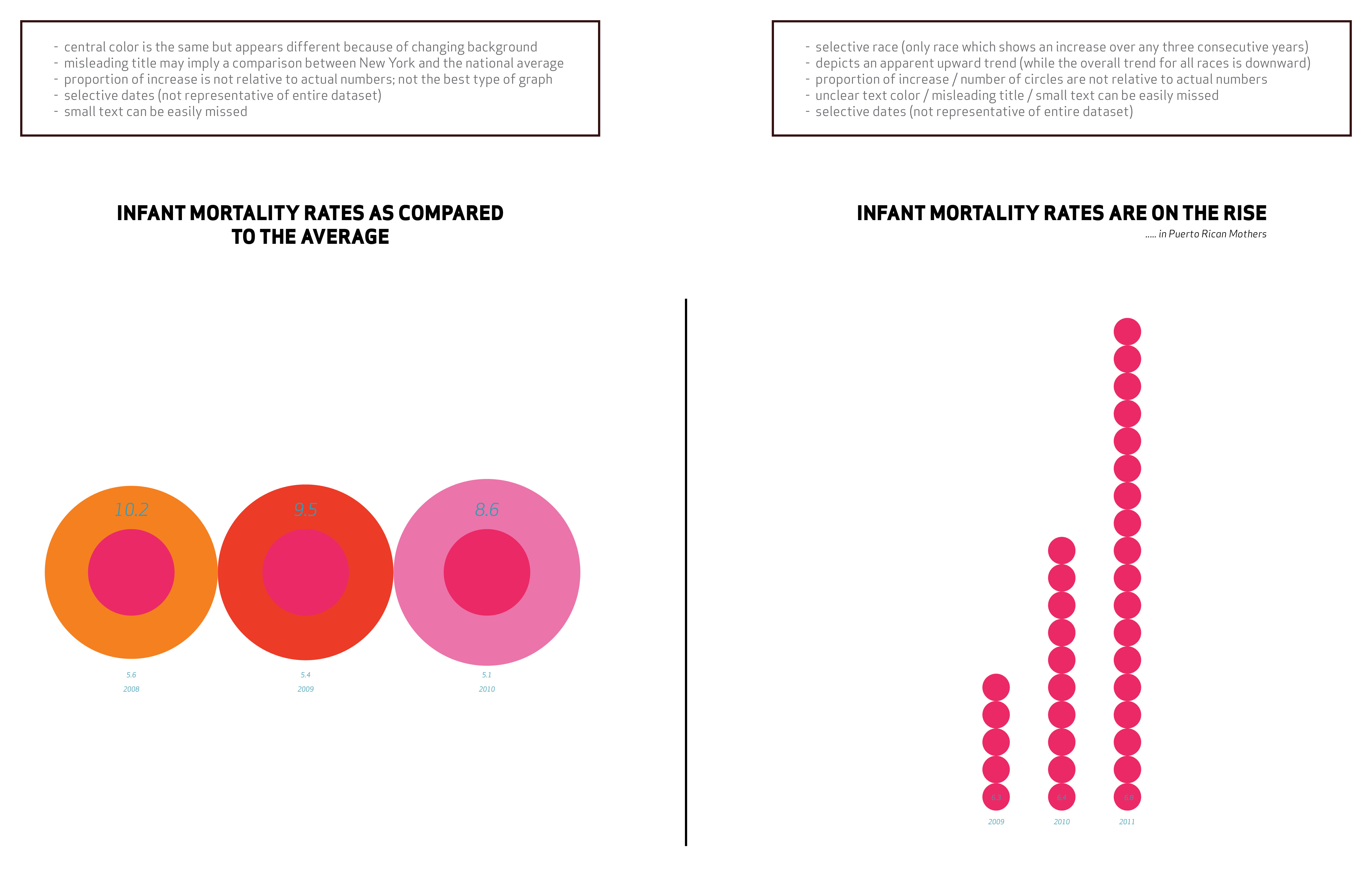
The data set for New York City’s infant mortality rate (2007-2014) provides data for each year by race as compared to the total number of live births; because of the specificity of these subcategories, the data reveals an alarming juxtaposition of deaths between the highest (Black Non-Hispanic) and lowest (White Non-Hispanic). While there are identifiable trends by race, the overall average of the data tells a different story. For this reason, it is important to fully explore the available data and its subsets as opposed to generalizing the information. Strategically leaving out entire pieces of the data is another problematic method which leads to false representations of these figures. The data can be further manipulated to tell a desired story by including only certain years to depict an apparent trend that is not accurate upon examination of the entire range of data. To further confuse such information, visual graphics can be used to exaggerate the desired data progression. One way to do this is with color, as unclear choices lead to misinterpretation. When using a color that can appear different on different backgrounds, it is difficult for the audience to recognize the subtleties of the comparison. Another visual misrepresentation method can be found in the use of disproportionate graphics. While technically there may be a two percent increase in the data, a graphic that doubles in size gives the illusion of a more drastic trend. Text legibility also leads to the misreading of a data visualization, where if the text is too small or the font too difficult to read the viewer may skip over it entirely. This is particularly problematic when the graphic is already employing other misrepresentation tactics, and the title or any other larger text is misleading or otherwise unclear.